Busfor

Project Overview
Busfor is an international (mainly in Eastern Europe) marketplace for searching and buying bus tickets for intercity and international rides. Now works in Russia, Belarus, Ukraine, Poland, and the Czech Republic.
The platform is used by 7,000 bus carriers, and ticket sales reach $4 billion a year.
At the end of 2019 Busfor became part of BlaBlaCar.
Product team
CPO, Product Manager, Project Manager, Product Analyst
My role
Development and support of the Busfor visual language on all digital channels:
- Web& App User Experience
- Marketing Ads (offline/online).
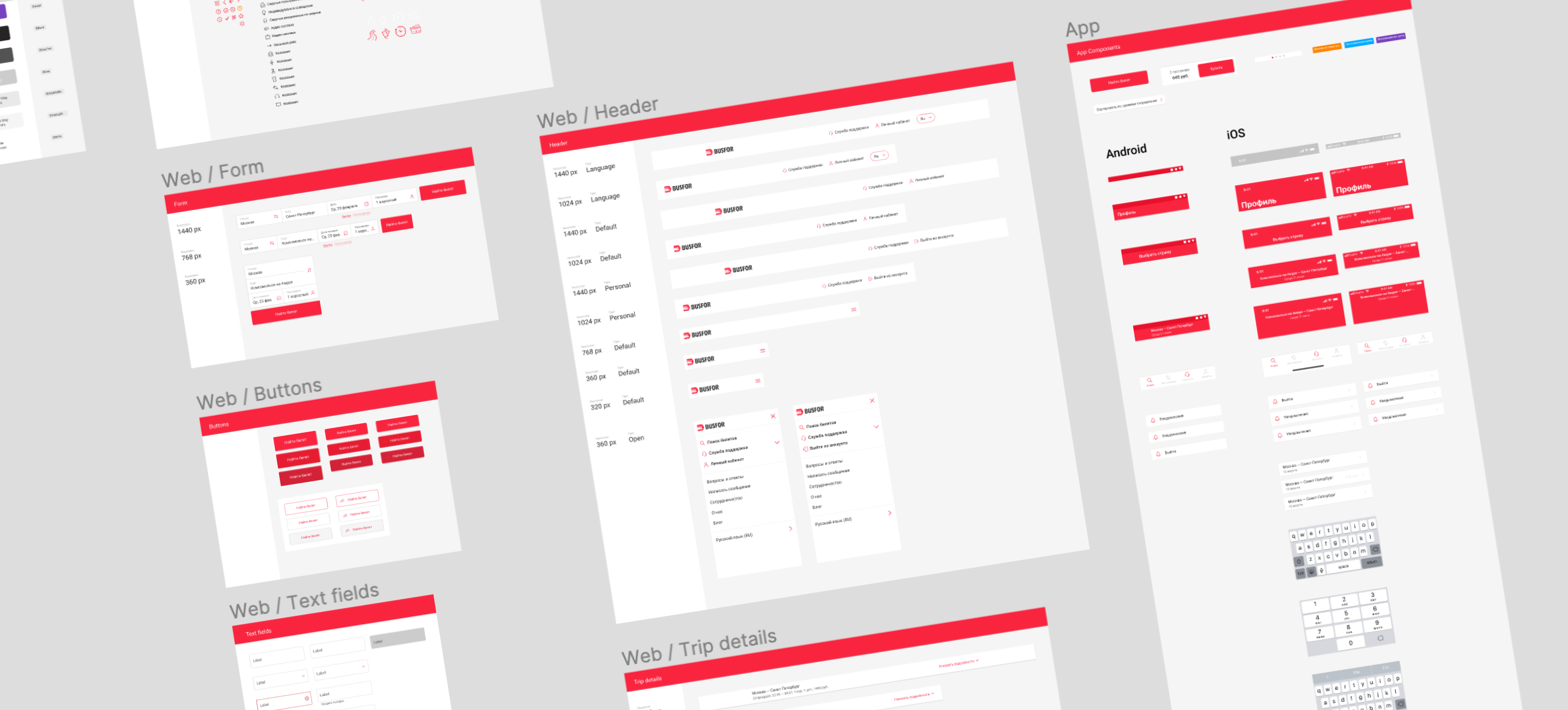
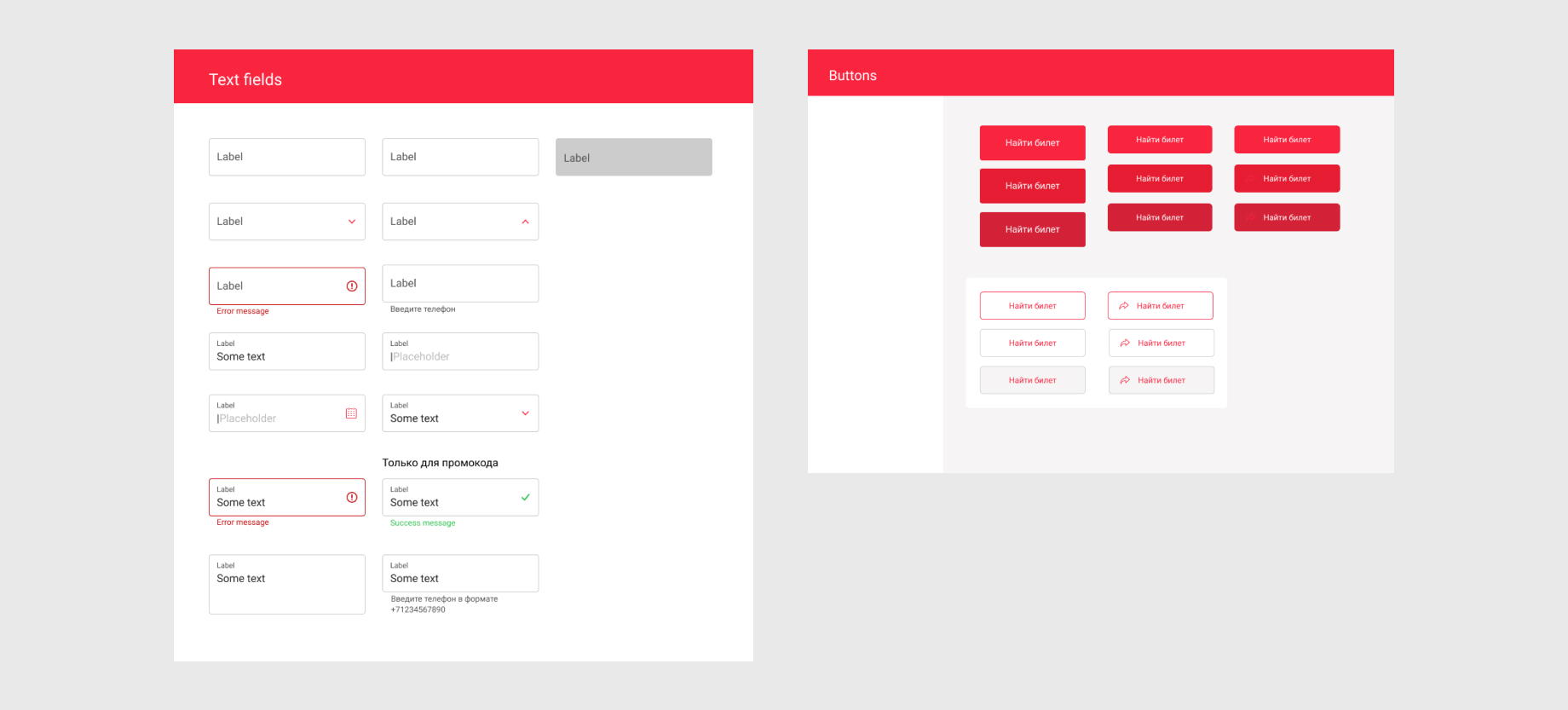
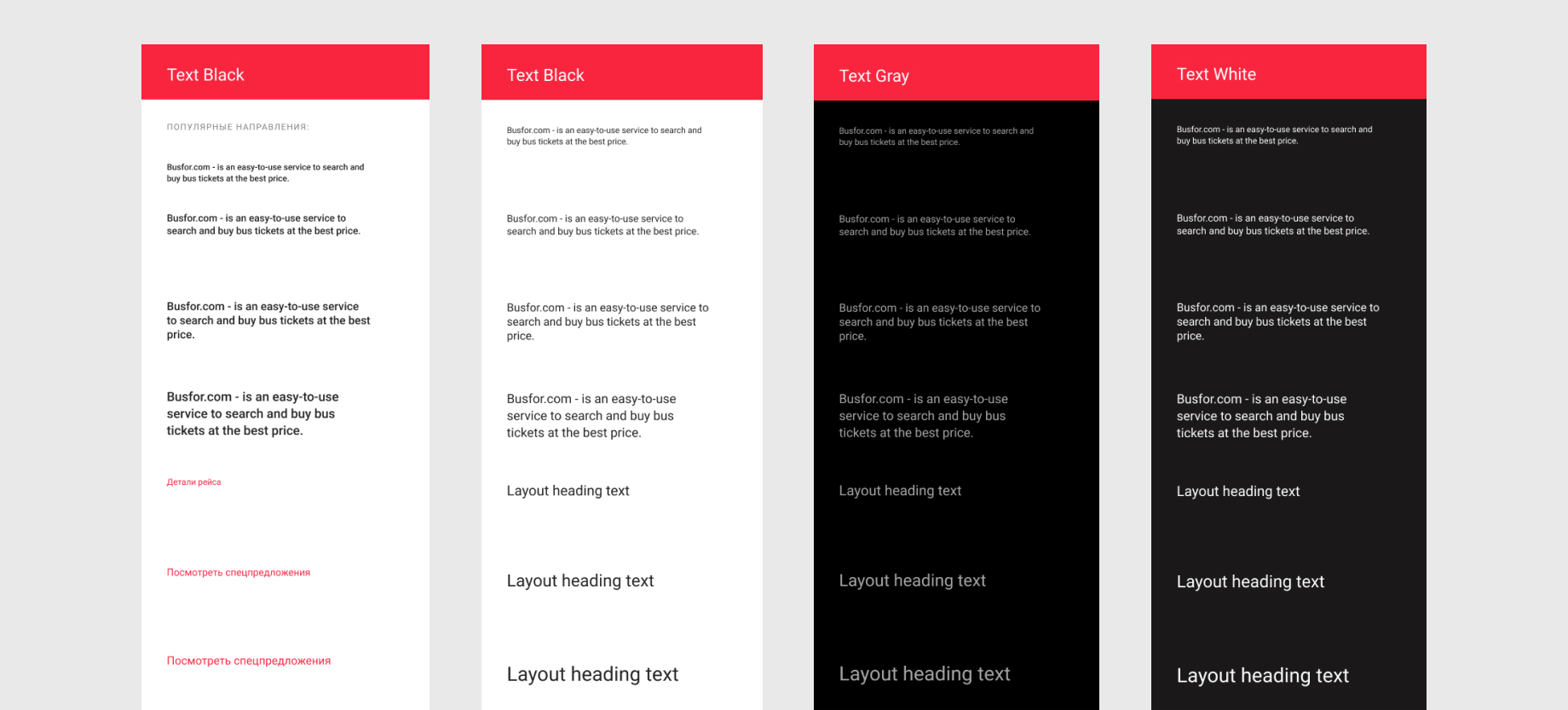
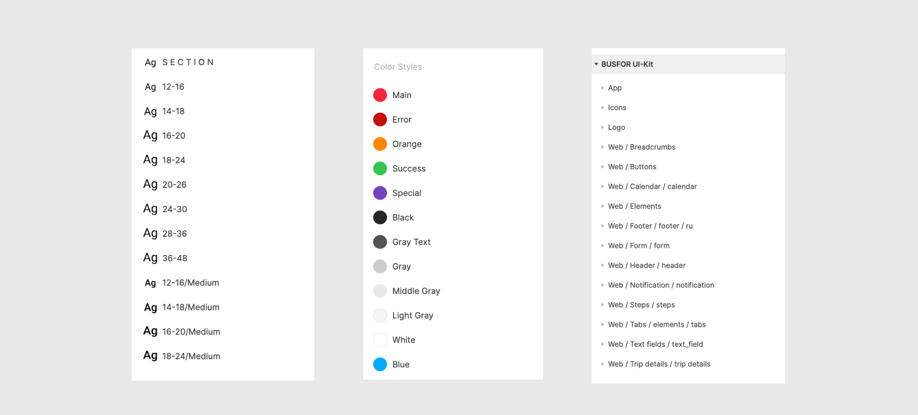
Prototyping for early stages of feature development and creating a UI-Kit as the first step to creating a design system.
Search for painful points in the user's scenario in collaboration with a product analyst (the total CR to purchase, CR to next step in funnel, Retention etc)
Implementation of the Hotjar feedback analysis/heat map display tool and analysis of user insights
The process
We have the different set of features coming to product roadmap:
Ideas based on insights we get from Hotjar and Customer Support - usually, changes to existing functionality to improve some important metrics - for example, decrease dropoff rate on our landing page from search engine.
We start putting high level requirements into the roadmap. Each problem gets discussed with business department and Product team. We generate a couple of ideas and as result, I am jumping to Figma (previously in Sketch) and making one or two design variations.
The next, the idea can be checked in the hallway usability testing (with our colleagues from the department of connecting partners-carriers or sales department). After developing the MVP of feature, we check this in production through A/B testing. Product analyst подготаливает отчет в реальном времени. We look at the metrics that we have identified as a success factor and improve the feature.
The challenge & solution
Design guidelines
One of the many challenges of this project was a leading design of all platforms. It needs to control and developing a visual and interaction experience in all product.
Since I am the only designer in the product, first I wanted to create a visual system that would make it easier to control the visual experience of both platforms (Web, app). This system became the design library in (Sketch, then Figma) and updated and implemented components in the code).
When I joined the team in 2018, there was a long-standing trend for mobile experience in products. I spoke with the frontend team and suggested that they rebuild the flow of work and work with the design from a smaller to a larger resolution. This is how we set the vector for the mobile first approach.
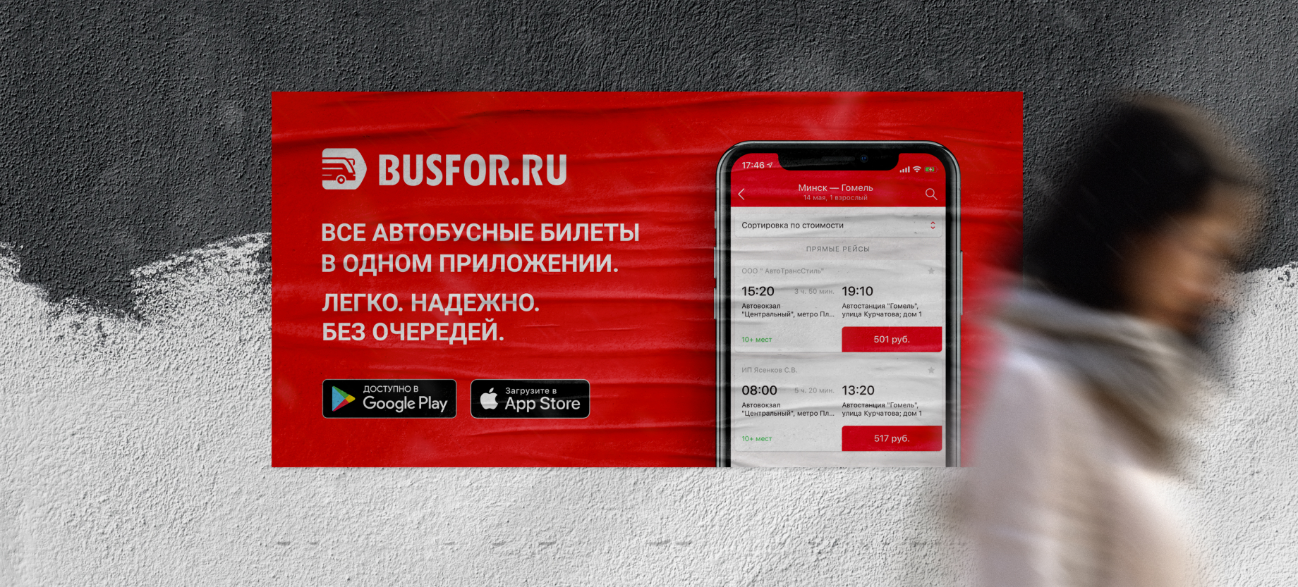
In addition to this, I received many requests for offline advertising at bus stations. The ad was aimed at installing a mobile app, or at increasing the brand's popularity among passengers at bus stations.
Advertising at bus stations could be have different sizes and the design solution had a problem of scalability. I developed a solution that could easily fit into different media formats and at the same time solve the main task of offline advertising: increasing brand awareness among passengers-customers of bus stations and installing a mobile app.

App redesign
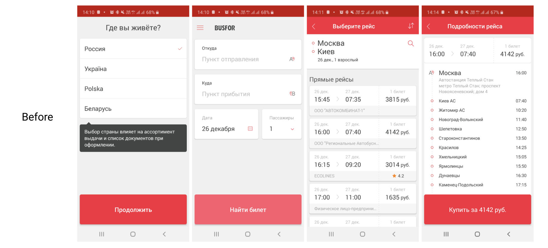
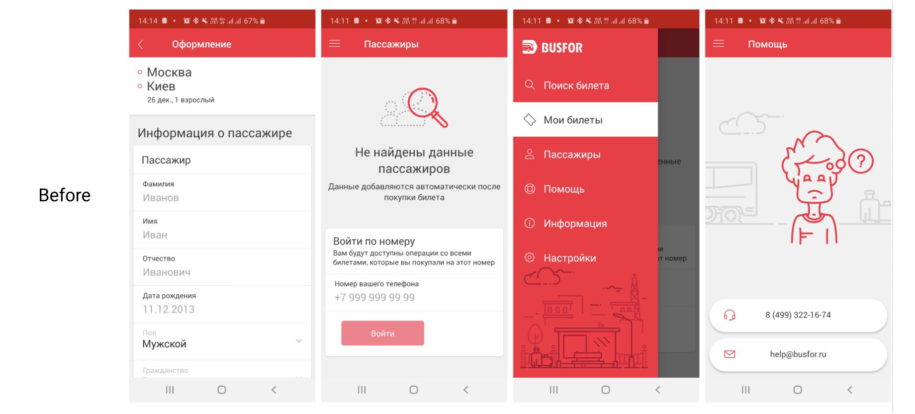
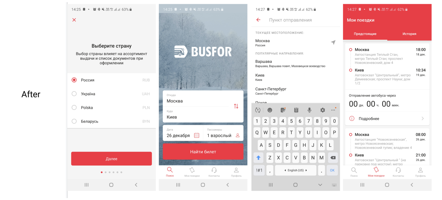
In terms of functionality, the app clearly remained from the web version, so the main forces were thrown there.
Features
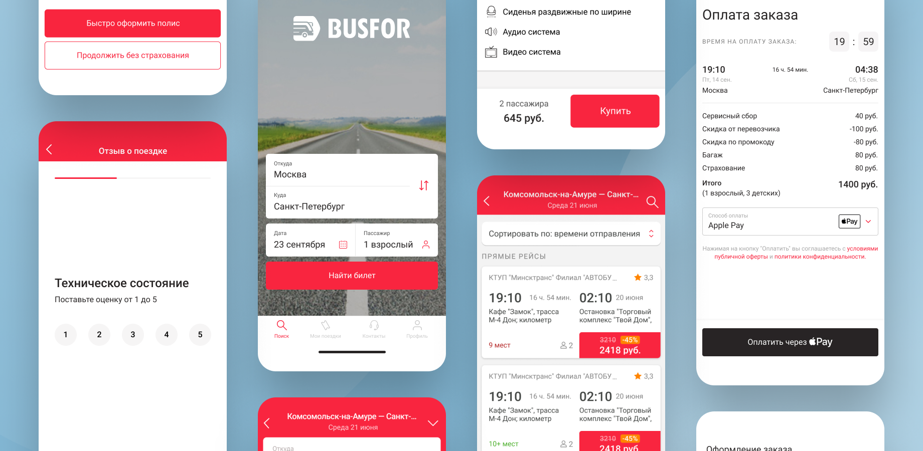
To begin with I identified critical points in the user experience and together with the mobile team the following features were updated:
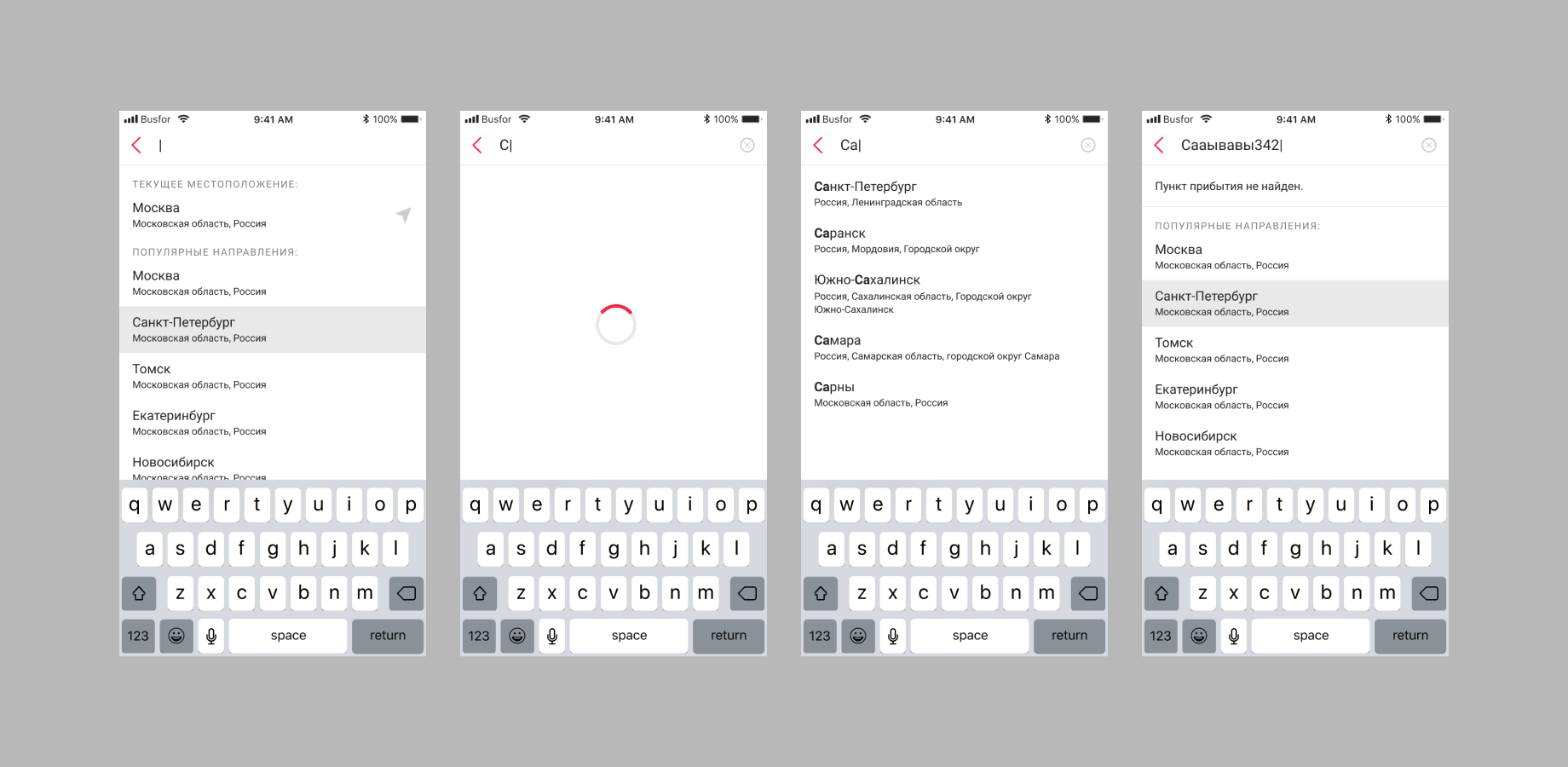
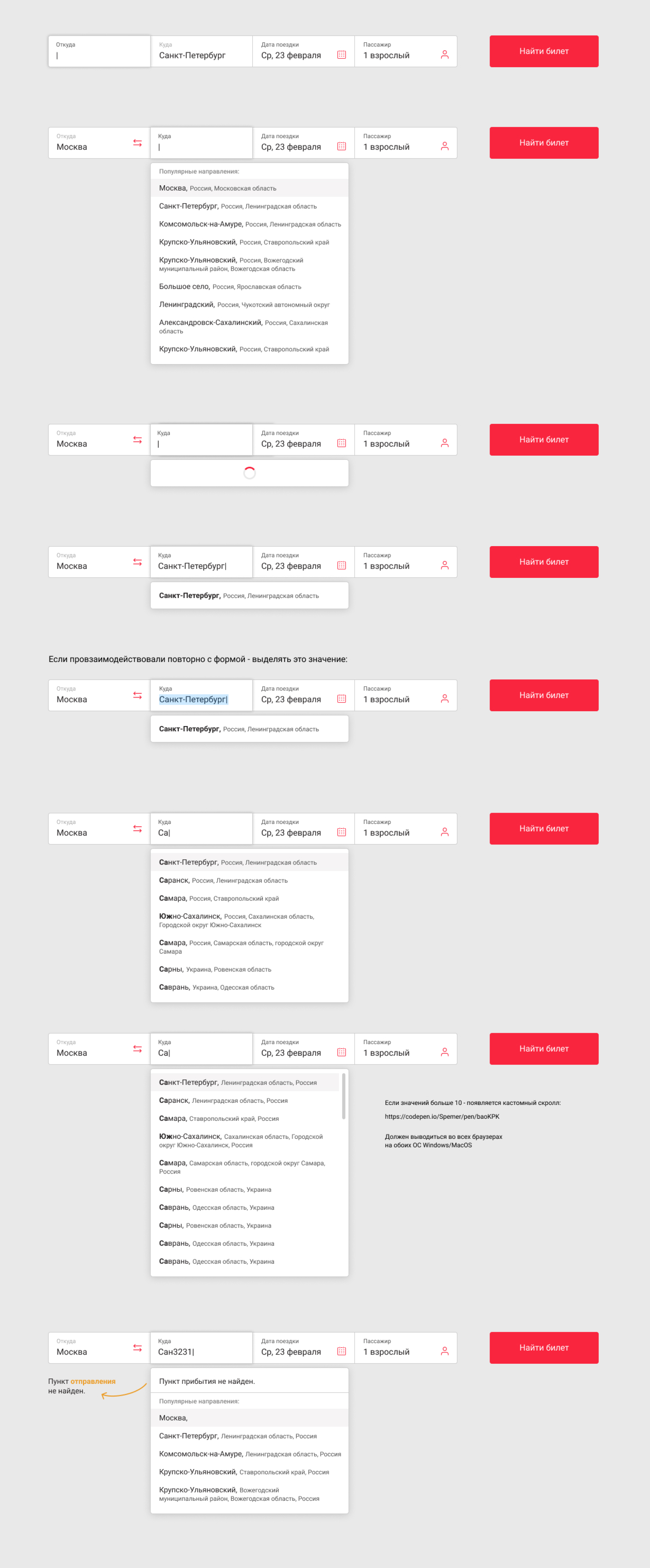
New suggestions in search results
In new suggestions, the download state is added, which solves the problem of a long response from the server. The user does not think that the service is hanging.
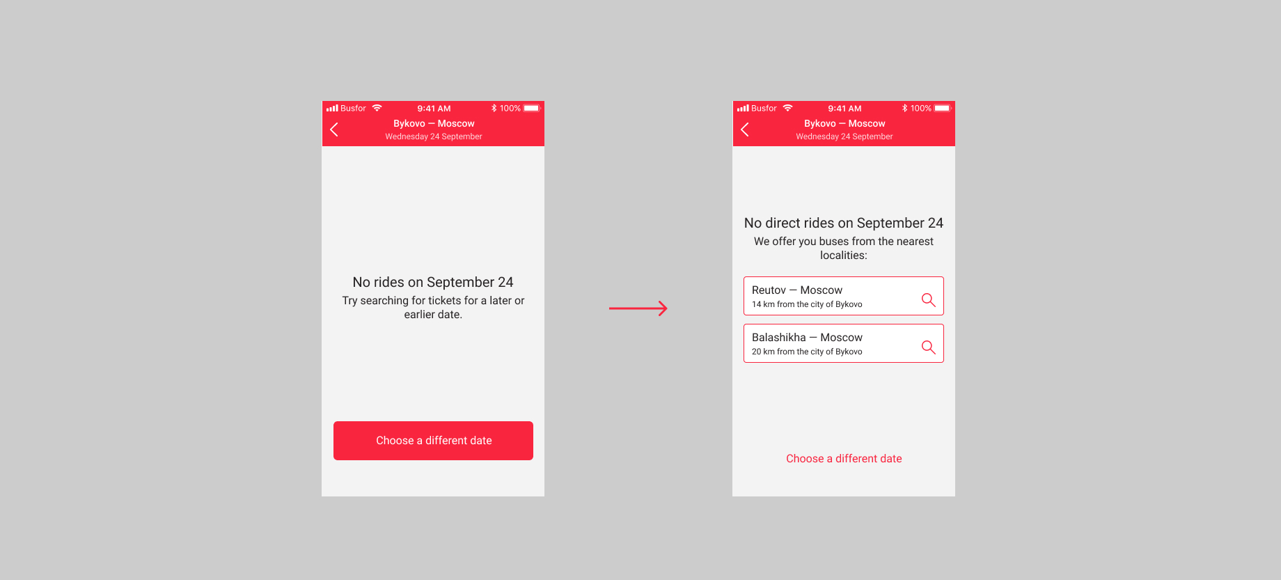
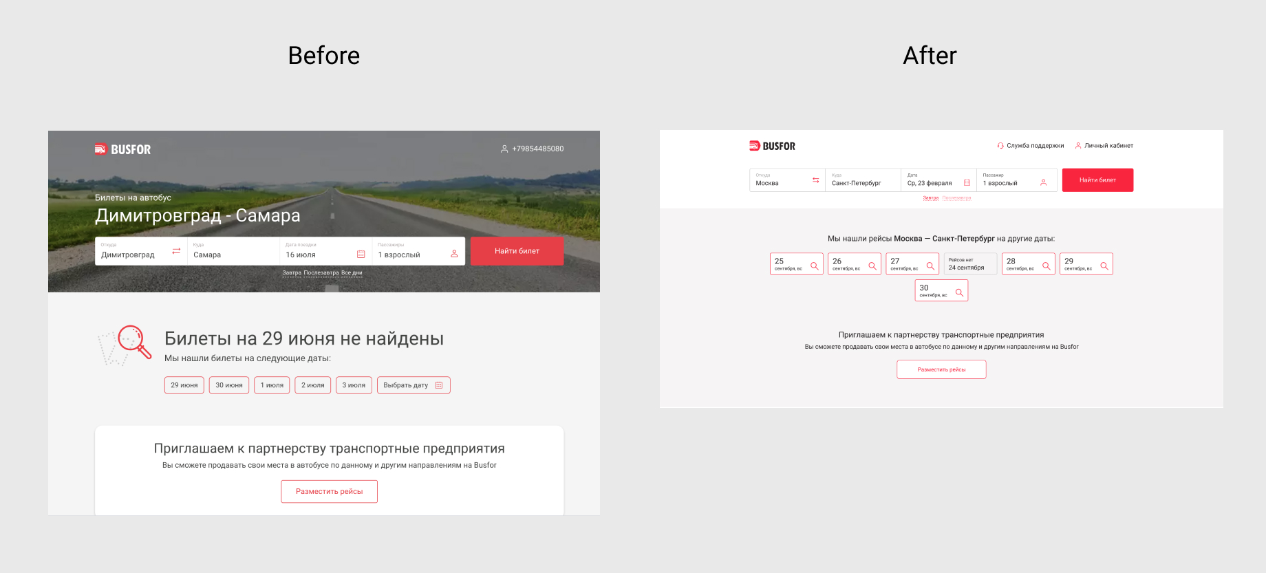
Processing null searches
There are two types of null searches: there is no such destination and there is no rides for this date (for example: some destinations have regular trips every other day).
When a user encounters this state in the interface, an incorrect message about what is happening can cause the wrong impression and withdrawal.
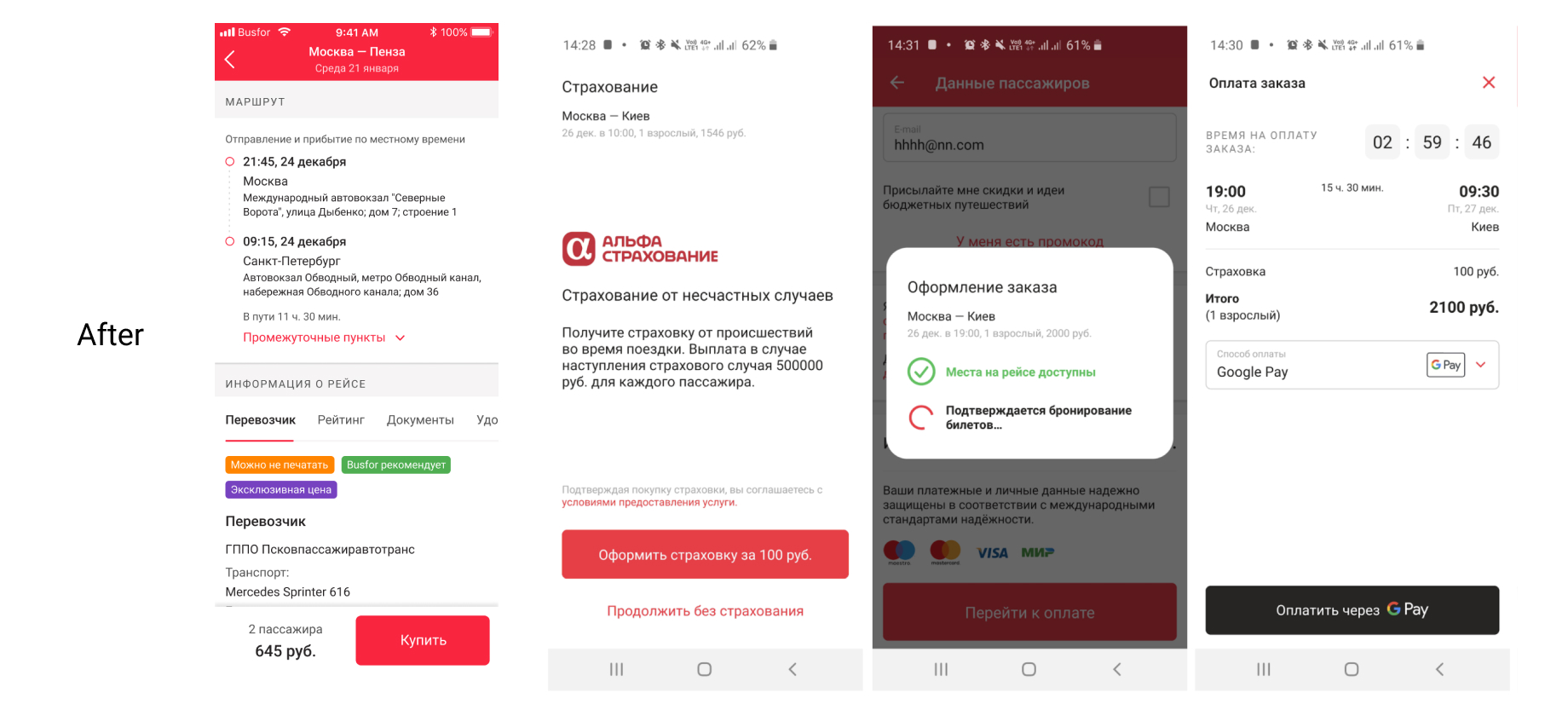
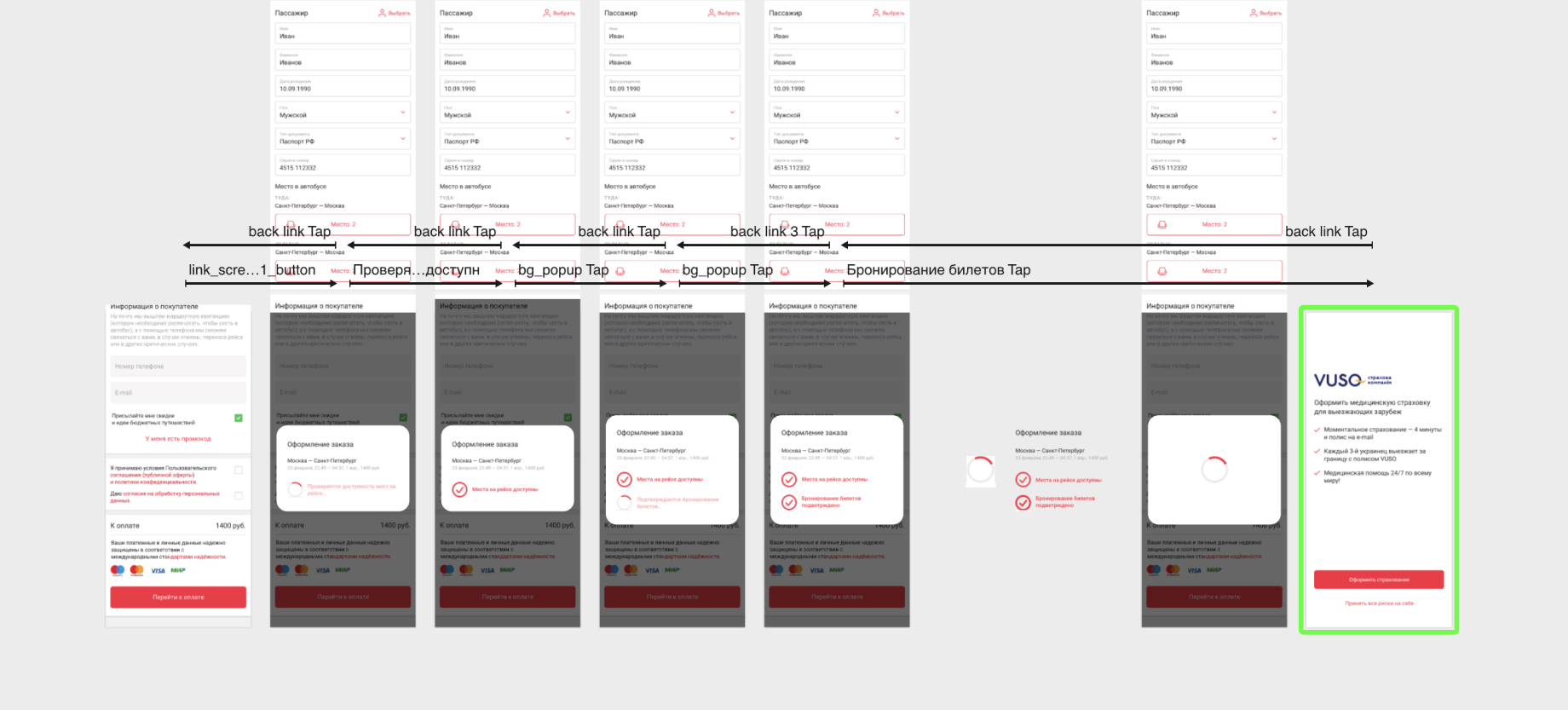
State of loading to payment/insurance page
- While the user entered the data, the place was booked
- Server error and other errors
In this section of the product funnel, there may be some problems:
To make the indication of these errors as loyal as possible and not interrupting the user experience, I made a mockup of the animated loader. I used Principle to show how It will work and show it to the developers as instruction.
Increase the average app rating in the App Store
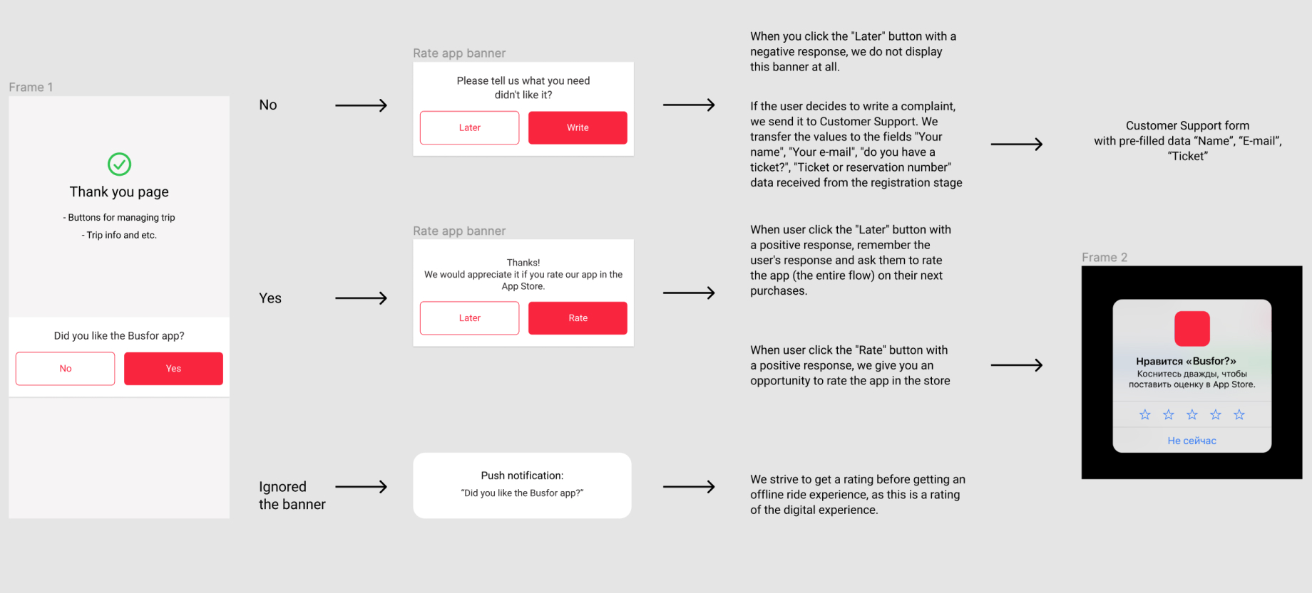
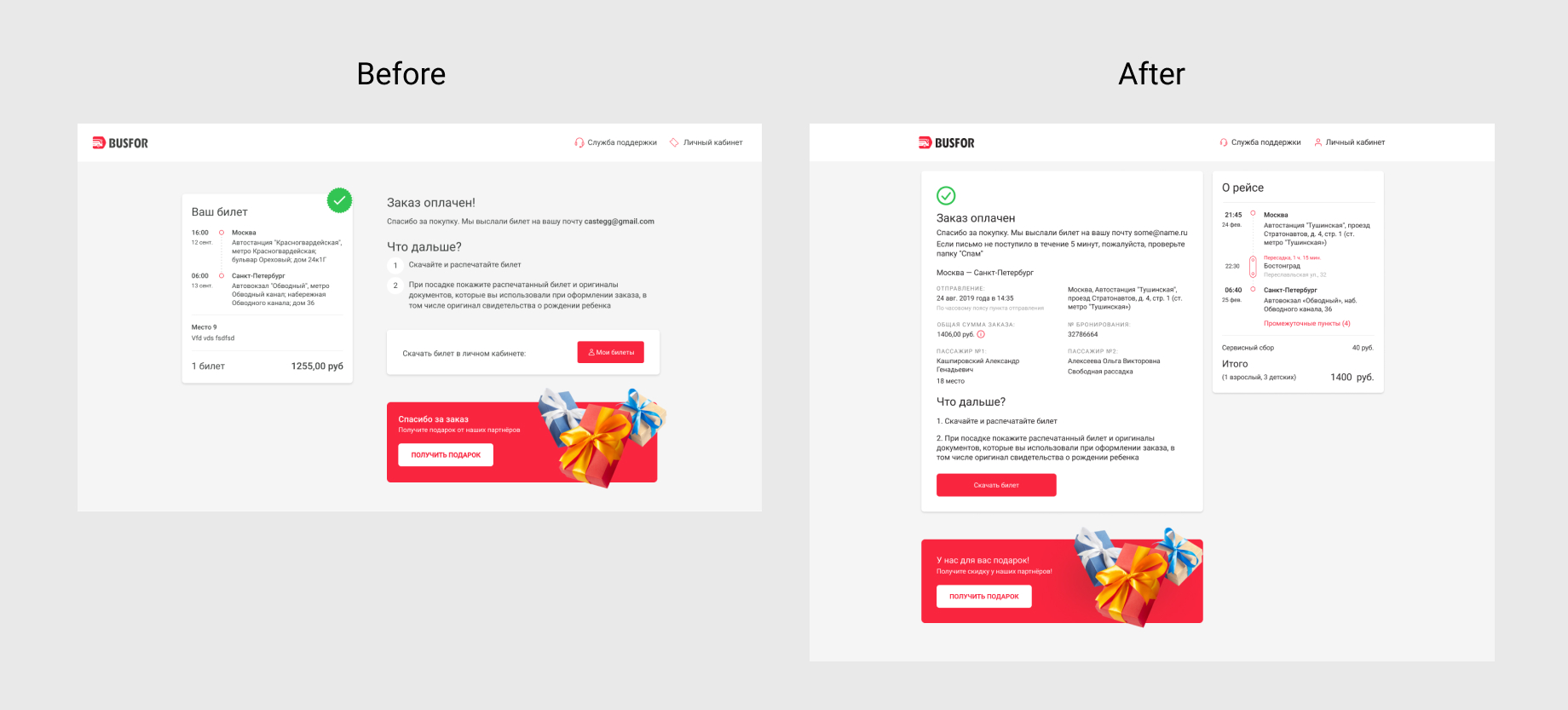
In order to collect a lot of positive feedback, we suggest evaluating the app at the moment when the user completed their task (ticket purchase) and got the experience - on the order confirmation page.
We offer to evaluate the app and, depending on the response, direct it to different points in the interface. If the answer is negative, you are asked to fill out a request to support (pre-fill in the fields with the person's name, email, booking number, ticket availability), and if the answer is positive, evaluate the app in the store.
Result: overall rate in App Store ???
Results
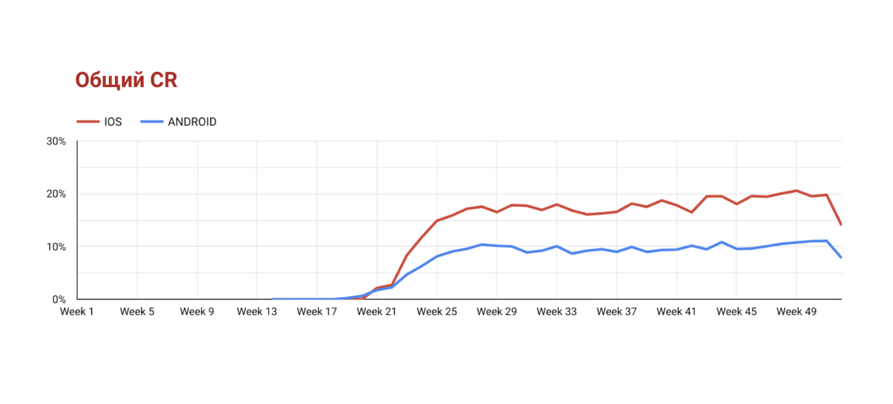
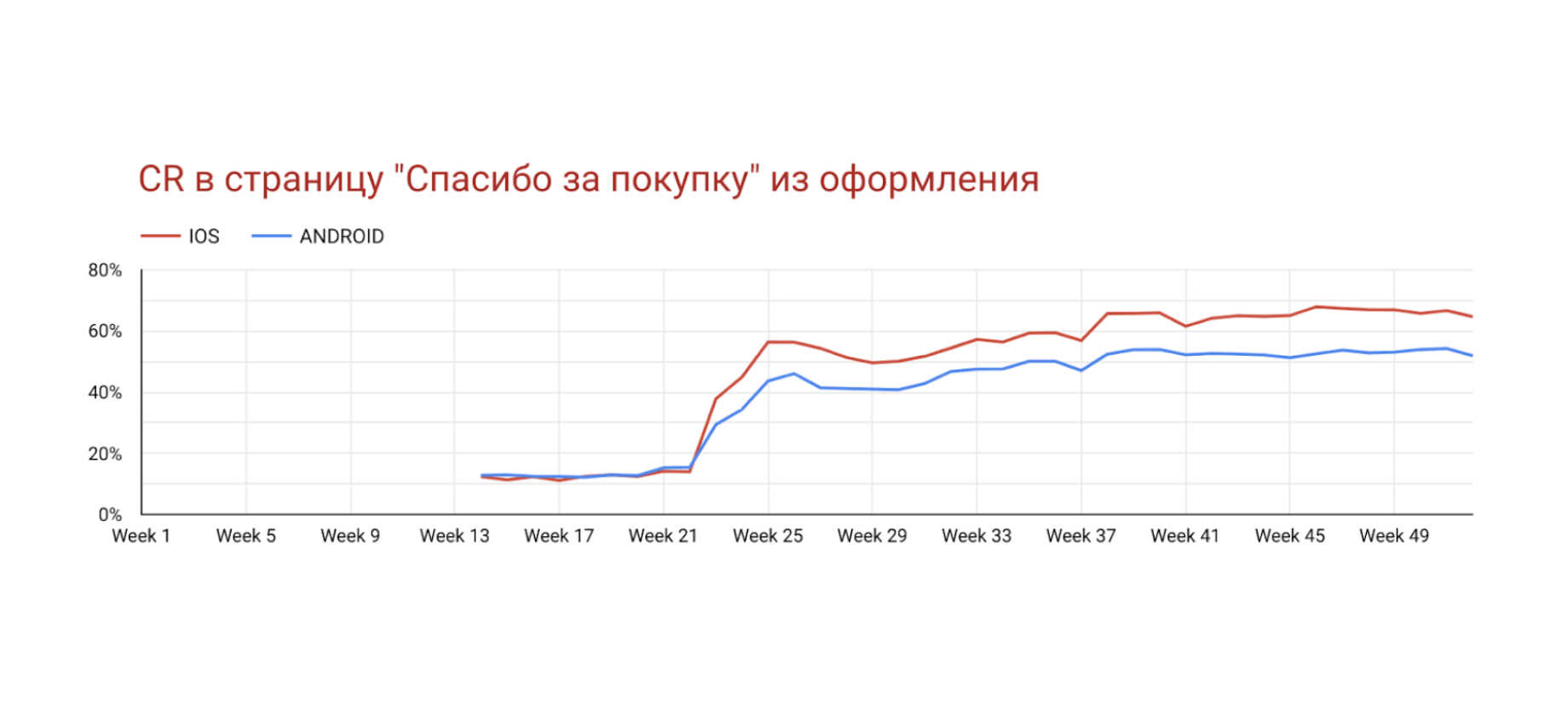
Overall conversion increased by 9% on iOS and by 5% on Android
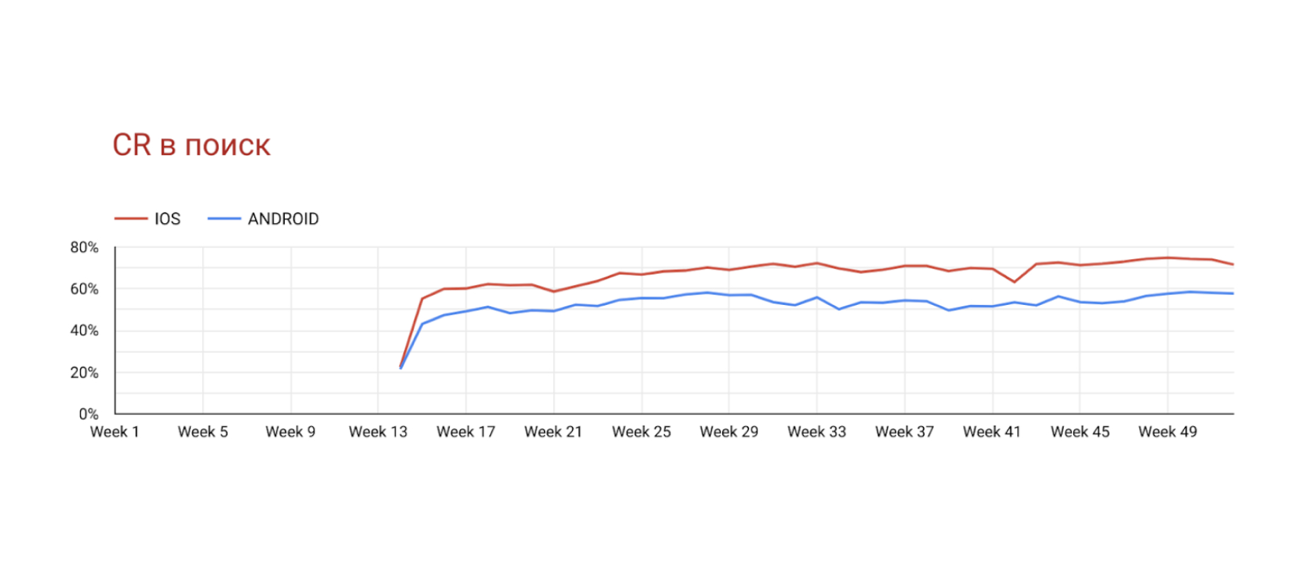
CR in search increased by 13% on iOS and by 8% on Android
CR from booking to "Thank you page"  increased by 10% on iOS and by 11% on Android
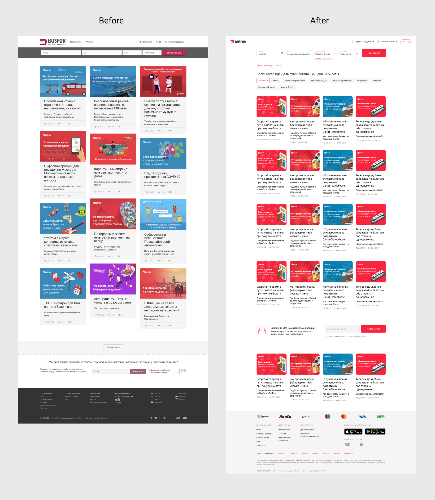
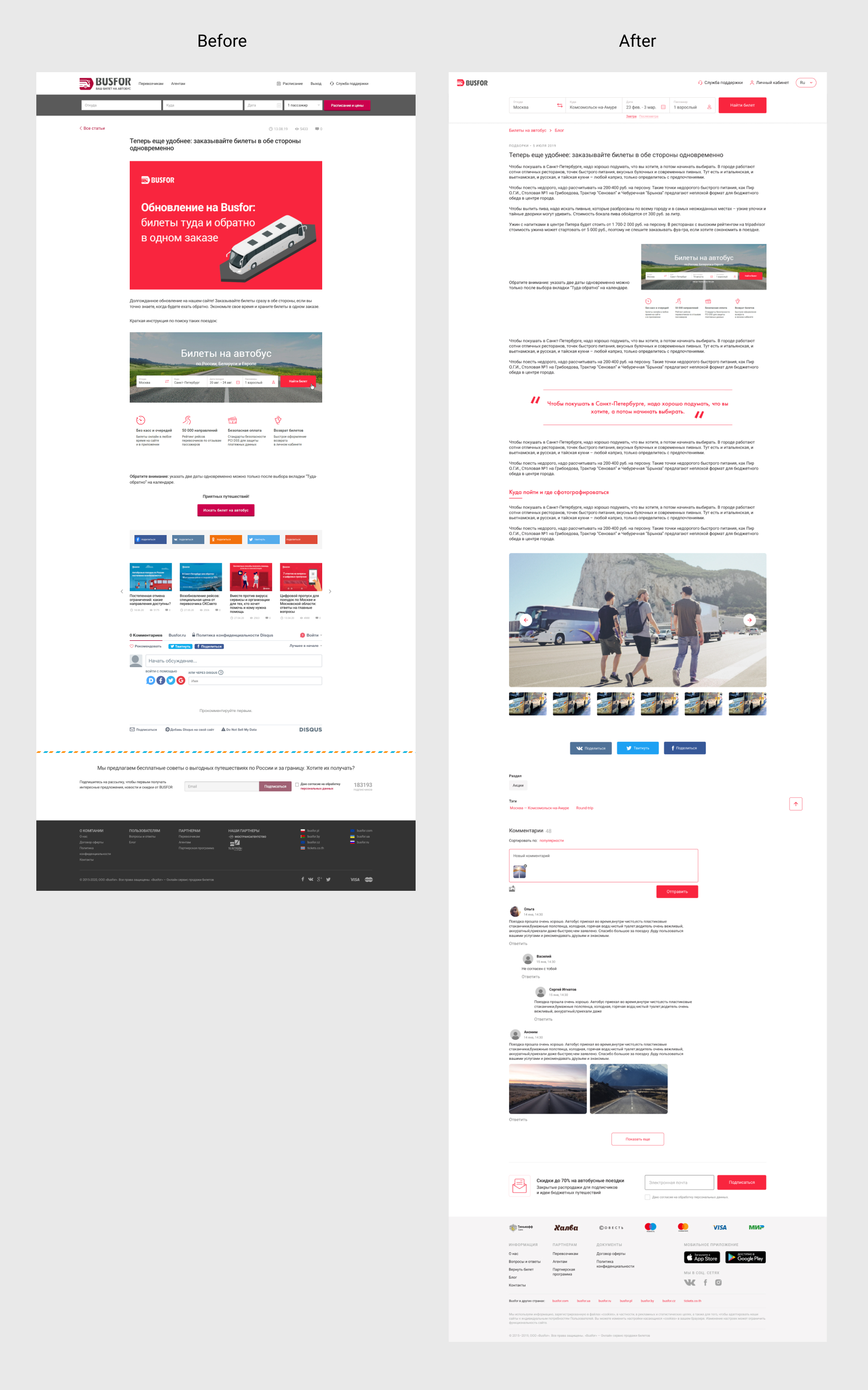
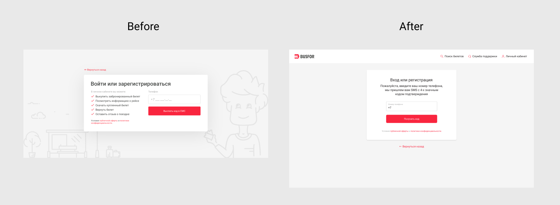
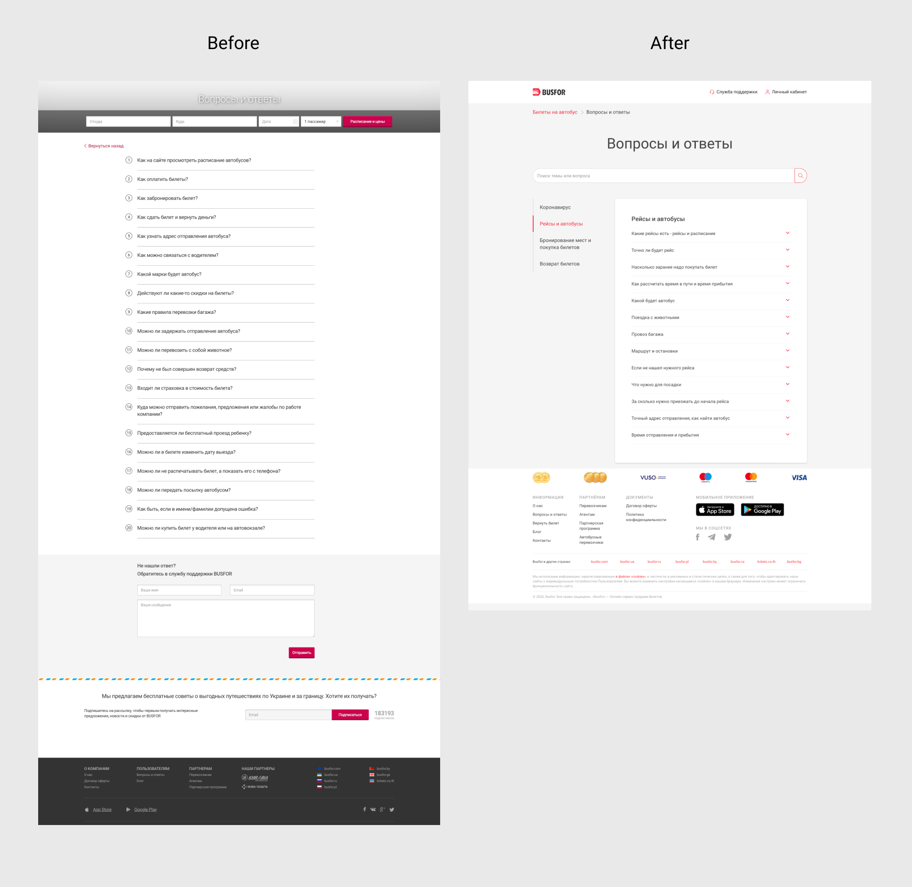
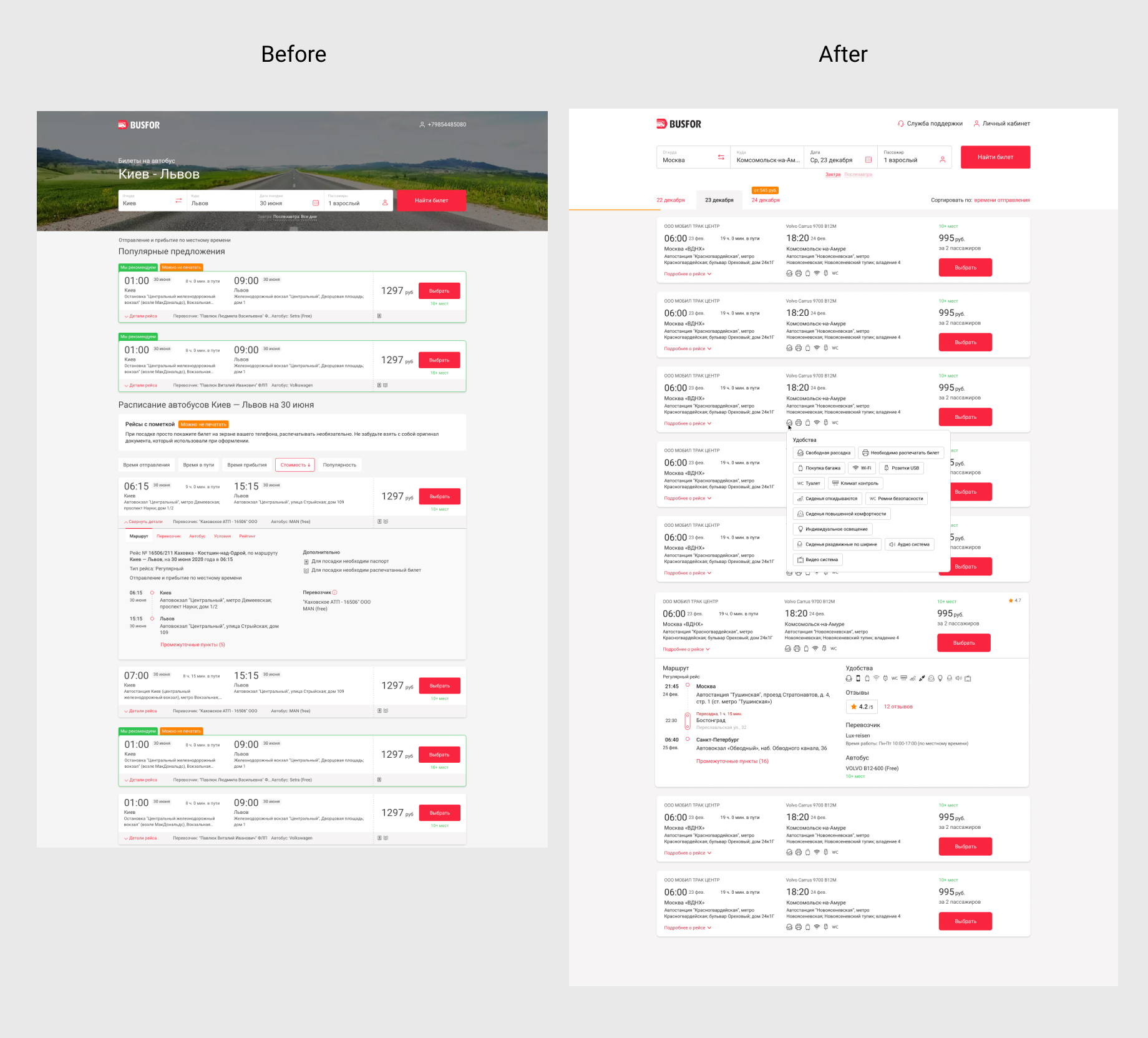
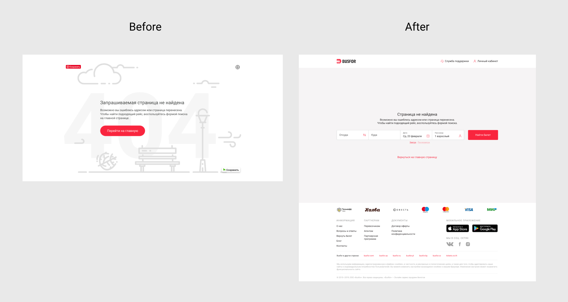
Web mockups

Want to work together?